Domain RegistrationFind the perfect domain for your business or personal site with ease.
 Web HostingAffordable Canadian web hosting, user-friendly and reliable.
 WordPress HostingFast, reliable WordPress hosting in Canada. Perfect for blogs and businesses.
 Email HostingCreate branded email accounts with simple, affordable email hosting.
 Reseller HostingStart your own hosting business with flexible reseller hosting plans.
 Affiliate ProgramJoin our affiliate program and earn commissions by referring customers.
 Windows HostingFast, reliable hosting for your Windows-based sites and applications.
 Cpanel HostingHosting made simple with the user-friendly cPanel dashboard
 Domain TransferTransfer your domain to us and keep your website running without interruption.
 WHOIS LookupQuickly find who owns a domain with our easy WHOIS search tool.
 SSL CertificatesProtect your website with trusted SSL certificates.
 All TLDsSecure the domain you want. Explore Canadian and global extension options.
 .com DomainSecure a globally trusted domain and start building credibility from the very first day.
 VPS HostingReliable VPS hosting crafted for performance and peace of mind.
 Managed VPSNo technical skills? Let us manage your VPS for you.
 Dedicated ServersTake full ownership and control of your private dedicated server.
 AI Website BuilderCreate your dream website with the power of AI in seconds.
 Online Shop BuilderLaunch your store quickly with powerful, easy-to-use tools.
 BlogRead our latest articles and stay ahead with expert insights.
 Contact usGet in touch with our team today, we are here to help.
 SupportFind help and guides for all our services.
Once your website goes live, users will judge 94% of first impressions and 75% of website credibility on website design, according to WebFX.
They judge your site before they even read your content, which tells you just how important web design is to the success of your website.
If your site looks like it was designed in the dial-up era, visitors will be clicking that “X” button faster than you can say “GeoCities.”
This fifth part of our Websites Explained guide focuses on web design and how to optimize user experience. We’ll also help you to plan your website so that you can start on the right foot.
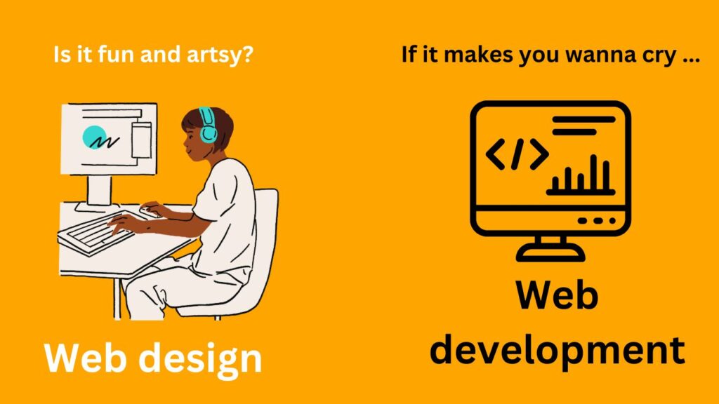
Web Design vs Web Development
Web design refers to the process of planning, conceptualizing, and arranging the visual and functional elements of a website. That includes aspects like layout, color schemes, typography, graphics, and the user interface.
The goal is to create an appealing and intuitive user experience that aligns with the website’s intended purpose and target audience. Since it involves elements that users interact with directly, the web design process is deeply customer-centric.
In contrast, website development refers to all the processes associated with designing, building, and maintaining a website and all related software applications.
In other words, web development refers to the coding and programming required to build and maintain functional websites, web applications, and other web services.
This guide focuses mainly on the web design aspects listed below:
- Appearance, such as colors, graphics, and typography/fonts
- Responsiveness/adaptive design, meaning how a website displays on different screens (scaling, resolution, loading, etc.)
- Free Code Camp has wonderful resources on responsive web design that you can use
- User experience, such as ease of navigation, accessibility, usability, and how information is organized (information architecture)
- Branding, or how to maintain a consistent look, feel, and tone throughout your site
- Search engine optimization (SEO), meaning the factors that help a website rank higher on Google for specific queries
Web designers are more artists than programmers. They rely on skills like graphic design, layout design, visual design, SEO, user experience (UX) design, and natural creativity to create a concept of how a website will look and work.
Web development
Web developers take a website design and code it into existence. They’re the people who mess around with PHP, JavaScript, and other scripting languages, which is why it’s also called web programming.
This brings us to the concept of front-end and back-end scripting. Front-end developers work on the side of the website that’s visible to clients. That’s the layout, navigation, visuals, and interfaces.
Back-end developers deal with the nuts and bolts of what makes the site work. That means the databases, file systems, APIs, site architecture, site security, and servers behind the website. Full-stack developers handle both front and back-end development functions.
How to Plan a New Website
Before we get to designing your website, we need a well-thought-out plan.
If you go straight to designing and building your site, you run the risk of ending up with a cluttered, disorganized website that confuses and drives away visitors.
Take time to carefully map out your goals, target audience, content structure, and overall aesthetic. Not only does planning make your website more efficient by trimming unnecessary parts, but it also ensures a cohesive and friendly user experience.
More importantly, investing in comprehensive planning upfront gives you a clear roadmap to follow throughout the development process. This proactive approach can save you significant time, effort, and potential headaches down the line.
First, let’s set down the purpose and objectives of your website. This will give us a point of reference when making important design or layout decisions down the line.
Define the purpose and goals of your website
Starting a website without any concrete goals is asking for trouble. We strongly recommend that you take some time to develop your ideas and vision for the site. Once that is clear, define your objectives and write SMART goals.
For example, do you want to build an audience or grow an existing business? Are you starting an e-commerce store to sell things? Is it a blog to express your thoughts or create a community? Are you a freelancer wanting to find work with a pretty portfolio?
Or, are you simply starting a website as a hobby?
Don’t stop there. Your goals have to be more detailed and specific. In case you’ve forgotten, here’s what SMART means:
- Specific – clear and precisely defined goals, e.g, increase website traffic and conversion rate by 50%
- Measurable – have specific criteria for determining when objectives are achieved, e.g, website traffic and conversions are easily measured
- Attainable – the goals are realistically achievable using current resources and time limits
- Relevant – your website goals should be relevant to the success of your business in terms of revenue or mission, e.g., you can increase website traffic by using content marketing for higher Google rankings
- Time-bound – establish a clear timeline with milestones to track your progress and make adjustments as needed, e.g., increase website traffic by 40% in the next 6 months
Expert tip: SMART goals also create accountability. They remove ambiguity around expectations—either goals are demonstrably achieved through measurable results by the deadlines, or there is a clear lapse in performance. There will be no room for excuses.
Bad Design for Websites: What Not to Do
It’s sad how nowadays, many websites focus too much on aesthetics and neglect user experience.
Have you come across websites that use annoying full-screen images, carousels, or animations? If you haven’t, you should try one with scroll-triggered animations.
Apple is one example that uses animations heavily—check out the Vision Pro page.
A site like that one makes you go “Wow!” the first time, but all that endless scrolling makes subsequent visits incredibly annoying. Sometimes my finger hurts because I have to scroll so much!
Plus, users loading such a website using a slow internet connection will simply give up. Here are a few bad website design practices you must avoid at all costs:
- Cluttered layouts
- Tiny or hard-to-read text
- Busy backgrounds that reduce content legibility
- Autoplay videos/audio on page load
- Excessive pop-ups and ads
- Lack of responsive design for mobile devices
- Broken links
- Slow page load times
- Lack of clear navigation
- Poor color contrast levels
- Graphics or pop-ups that cover content (part of poor page experience)
We’ll see later how to optimize your website for user experience using free plugins and tools. The advantage of designing your own website is that you get to optimize it from the ground up, so let’s do that.
Where to Find Inspiration for Web Design Ideas
If you’re just building a simple website with free themes and templates, there’s not much need for creative inspiration. Most free website builders give you limited flexibility.
Regardless, if you have a big vision for what you want your website to be, you should finish this design guide and check out some gold-standard websites for inspiration.
You can find website ideas and inspiration from many sources. Websites that are particularly creative, well-executed, visually stunning, and functionally flawless can help you get started.
Awwwards is the best place to find website design inspiration. The platform ranks some of the best website designs in the world as voted by real-life professional designers.
Awwwards lets you explore the most popular web design elements, such as cursors, animations, and typography, or you can filter by color, type, or functionality.
There are tens of other website galleries you can visit to learn the latest and best in website design. The most popular ones include the following:
- Landing.Love – landing page animations
- Mobbin – for more simple commercial websites
- Land-Book – landing page designs by category
- Built for Mars – UX design inspiration and guidance
- Call to Idea website elements
- Landing Folio – landing page design
- Page Collective – inspiration for landing pages and user flows
- One Page Love – one-page website design, listed by category, especially portfolios
- Lapa Ninja – more landing page design
- A Fresh Website – endless design ideas and themes
Whatever design or theme you choose for your inspiration, remember to keep things simple. User experience should always come before aesthetics for long-term success.
How to Design Website Layout and Navigation
Aspire to design the simplest, most intuitive website layout and navigation you can.
That means you should work with as few elements as possible (sliders, buttons, images, etc). Don’t let a page look too busy or feel conflicting.
For starters, design the layout of every page following a visual hierarchy. Consider how people read the content on the page, which isn’t top to bottom as one might think.
Instead, eye-tracking studies prove that most readers use a Z-shape or an F-shape pattern.
It’s widely known that we don’t read through every piece of content on a web page. Rather, we scan through it and only stop to read if something catches our eye.
That’s why a web page with a lot of content, such as a blog page, should follow the F-pattern. Homepages, landing pages, and other website pages with less text and more graphics work better with a Z-shaped visual pattern.
Decide on website color and typography
In keeping with simplicity and minimalist design principles, you should have one base color for your site and use different variations to introduce elegant aesthetics.
To break monotony, play around with color saturation, light and dark tones, transparency, and other elements.
While at it, think about the contrast, readability, and harmony between all the different elements on each page. For branding purposes, it’s important to keep your chosen color scheme consistent throughout your website.
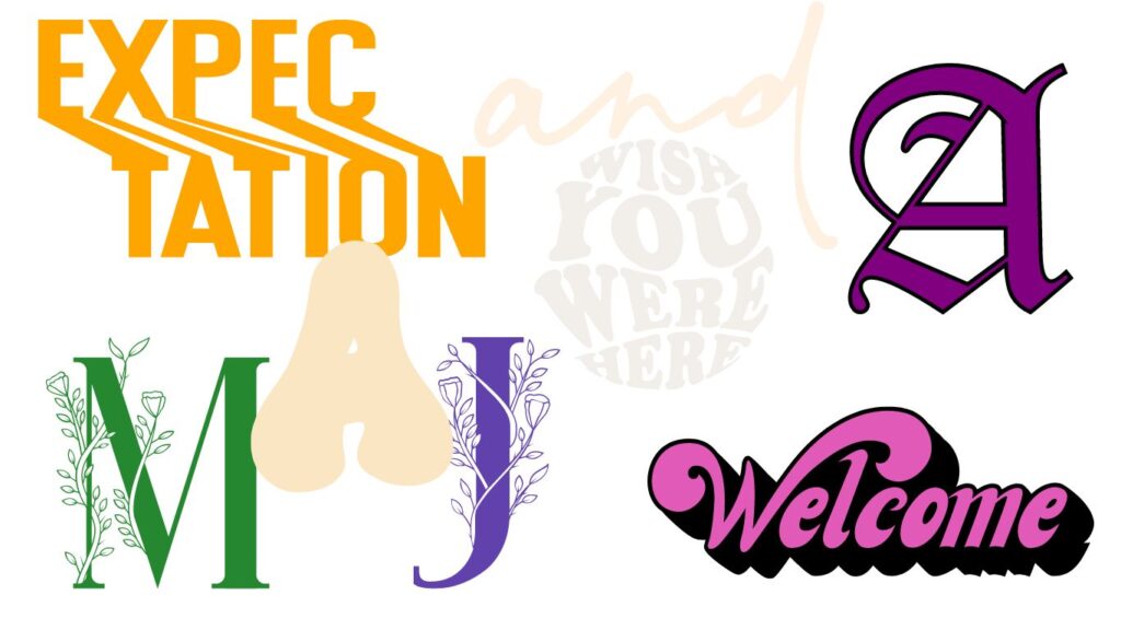
Typography also plays a vital role in the visual look and feel of a website. It even affects the vibe and personality of your site—some fonts are more playful, while others are formal and sophisticated. Your website’s purpose should help you decide on the right typography.
For example, while sans serif fonts are more elegant and classy, slab serifs are playful and bold. Similar to your color or theme, keep your typography consistent throughout your site.
Expert tip: The rule of thumb is to use no more than 2 fonts for your website. If you do decide to vary your fonts, don’t mix up serifs and sans serifs except to create contrast between headers and body text. Better still, stick to one font family so that you’re guaranteed everything will match. E.g., Source Serif Pro and Open Sans font families.
Website Layout and Navigation
When designing website layout, the golden rule is to keep things as simple and intuitive for the user as you can.
First, place the most important content “above the fold,” meaning it should be visible without scrolling. This is prime real estate that should be reserved for your value proposition, call-to-action, and other critical information you want users to see immediately
For the overall layout, use a grid-based system. Divide your page into sections or columns, and organize your content accordingly. This creates order and balance, making it easier for users to scan and digest information.
Designing website navigation
When it comes to navigation, less is always more. In keeping with the minimalist approach to design, aim to cut away all unnecessary elements and information. For instance, have few menus, buttons, and dropdowns – especially dropdowns.
To start with, put your main menu at the top left or top right. Choose one side and stick to it, depending on what your target audience would prefer.
Don’t clutter the navigation panel, though. Include only the essential pages or categories, as too many options overwhelm and confuse the user.
For the same reason, use clear, descriptive labels for navigation links and avoid vague terms. For example, use “Web Design” instead of “Services.”
If you have a large site with lots of pages, consider these navigational features as well:
- Breadcrumb navigation to show users their current location within your site’s hierarchy
- An example of breadcrumbs on a website: Home > Hosting Plans > Shared Hosting > Basic Plan. Notice how it creates a visual hierarchy
- Secondary navigation menus or sidebars – use these cautiously to avoid clutter and distraction
- Add a prominent and efficient search button so users can quickly find what they’re looking for
- Optimize your navigation for responsive design; for example, have larger tap targets for mobile devices and simplified menus for smaller screens
- Drop-down/mega menus that expand when hovering help to neatly organize links and save space
- Filtered navigation, especially if your site has various categories with many items. Users like filtering using criteria like price, color, material, etc.
- Related links – Suggest relevant pages at the end of content to encourage continued browsing
- Jump links- on long pages, jump links let users quickly navigate to different sections, just like having a table of contents
- Persistent navigation – Keep the main menu visible and consistent even when users scroll down to maintain seamless navigation
- User accounts – Personalize the user experience using custom navigation tailored to user history/preferences
Finally, ensure consistent navigation across all pages so users can find the same menu in the same spot, preventing them from getting lost.
For example, the “back” arrow should be at the same spot on every page, and the website logo should always take users back to the homepage.
As you can see, there are many subtle things you must consider when designing website layout. As your site grows, monitor user behavior so you can keep improving user-friendliness.
Advice on Creating Website Content
Content is the soul of your website. You’ll need to produce a lot of content for page copy, blog pages, sales pages, product listings, and more. This is often the most difficult part of building a website.
Our advice is:
- Have some content ready before you start building your website
- Research your competitors – find out what kind of content they have and match or exceed what they’re doing
- Learn the basics of website SEO, including keywords, readability, links, responsiveness, and technical SEO
- Have a library of custom graphics (which you can make with Canva) and brand material that you can reference as you go along to ensure brand consistency
- Don’t use placeholder text; take time to put in some real content as you go along; you can always change this later
- Check the SEO score on every page and blog article and optimize it following the suggestions given. The Yoast SEO plugin is one example that is used widely for this
- If you don’t have experience with copywriting, work with an expert on your most important pages, such as landing pages and the homepage
Once your website is up and running, commit to posting blog posts regularly to build up authority and trust on search engines.
Remember, this is a marathon, not a sprint. Take things easy and pace yourself.
Website Design and Development Made Easy With Olitt
Designing and building a website from scratch is difficult for anyone without coding or design experience.
So many people fail to pursue their dream of starting an online business because they don’t know where to start. That’s why we created Olitt, a user-friendly website builder designed to make building websites easy for everyone.
Olitt gives you a wide range of gorgeous, sleek, and modern website templates that are super easy to customize. You get to tailor every aspect to suit your taste, whether that’s changing the color scheme, uploading your own images, or rearranging the layout.
Powerful website builder for beginners – start for free!
Olitt isn’t just gorgeous. The platform also integrates seamlessly with popular third-party tools and services, such as payments, analytics, and marketing tools. Your site comes fully equipped to meet your needs.
You don’t even have to worry about website hosting and maintenance. We take care of all the behind-the-scenes work so that you can focus solely on growing your site and your business.
More articles in the Websites Explained Series:
- Website Fundamentals: What Is a Website and How Does It Work?
- Website Fundamentals: What is HTML, CSS, PHP, HTTPS, and SSL?
- Websites Explained: Easy Guide to Domains, TLDs, and DNS
- Websites Explained: Website Hosting Advice for Beginners